Closet Pilot
A wardrobe app that cuts the guesswork and boosts confidence.
Overview
The problem
Students struggle with choosing daily outfits due to:
Decision fatigue every morning
Weather + schedule complexity
Forgetting what they own
Lack of confidence without validation
Existing apps fail because onboarding takes too long and suggestions feel generic.
The goal
Create a wardrobe assistant that:
Reduces cognitive load
Provides personalized + context-aware outfit suggestions
Minimizes setup friction
Supports private, confidence-building validation
Helps users rediscover their wardrobe
Duration: 12 weeks
Team: 4 UX Designers
My Role: UX Research → Concept Lead
→ Interaction Design → Prototyping
→ Testing → Presentation
Tools: Figma, Miro, OtterAI, Canva
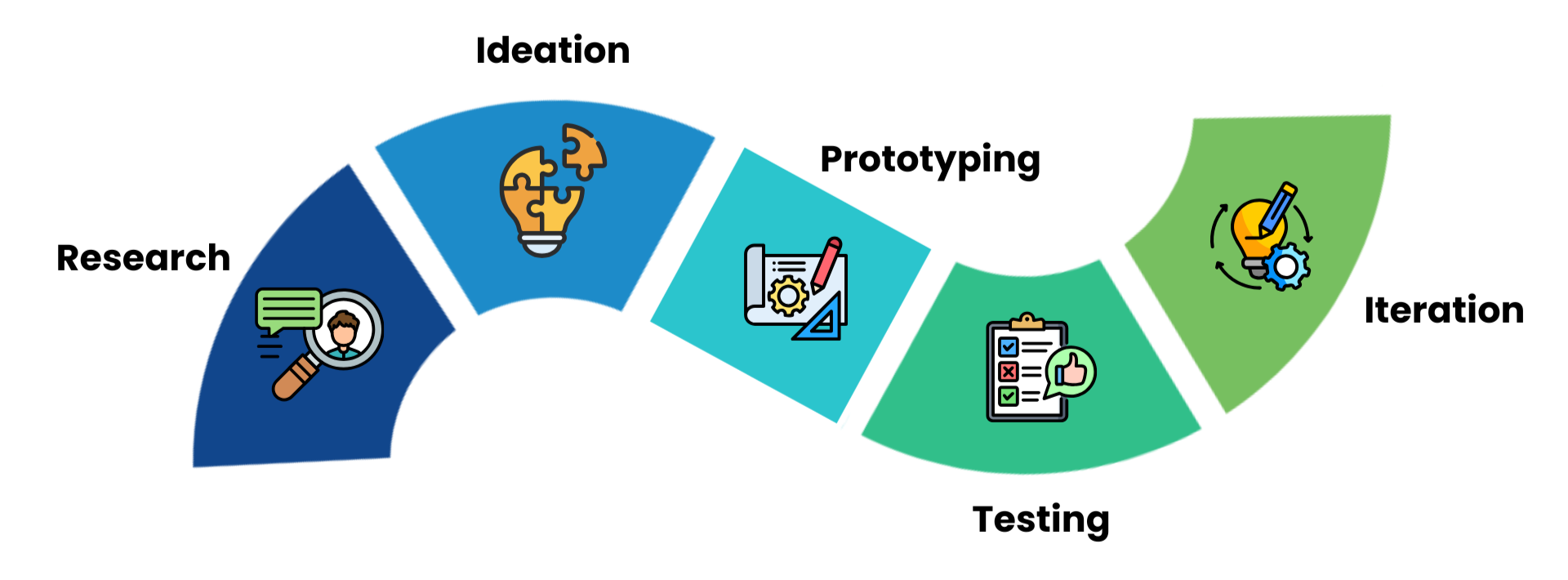
Process
Our process moved from research to insight synthesis, then to ideation, prototyping, and usability testing. Each step directly informed the next, allowing us to refine the concept through real user feedback.
Research
Our research phase used semi-structured interviews and thematic analysis to understand how fashion-conscious individuals actually manage their closets. It confirmed that decision fatigue, mental tracking, setup friction, and a lack of contextual, private support were the core problems our design needed to address.
Methods Used
Semi-structured user interviews
Participant screening survey
Thematic coding and clustering into 5 themes
Problem–Cause–Implication analysis
Secondary/industry research to contextualize findings
Research at a Glance
8 semi-structured user interviews
6 peer-reviewed articles synthesized
6 competitor apps analyzed
1 thematic analysis
1 Problem–Cause analysis
Key Insights
Mental tracking dominates: people rely on memory and “out of sight, out of mind,” leading to forgotten items and outfit repetition.
Decision fatigue is common: especially on busy mornings or for non-routine events.
Setup friction blocks adoption: manual photo cataloguing and tagging feels like too much work.
Social validation matters: people lean on friends/family for feedback but dislike performative, public features.
Lack of context-awareness: most tools ignore weather, occasion, and travel, making suggestions feel disconnected from real life.
My Contributions
Conducted secondary research, reviewing 3 peer-reviewed articles to understand wardrobe behaviour, decision fatigue, and existing gaps in fashion-tech tools.
Drafted the interview script and screener questions, aligning them with our research questions and secondary research.
Conducted 2 semi-structured interviews and documented detailed notes.
Contributed to the thematic analysis, grouping participant notes into the 5 key themes used in the report.
Built the Problem–Cause–Implication table, connecting raw findings to concrete design implications.
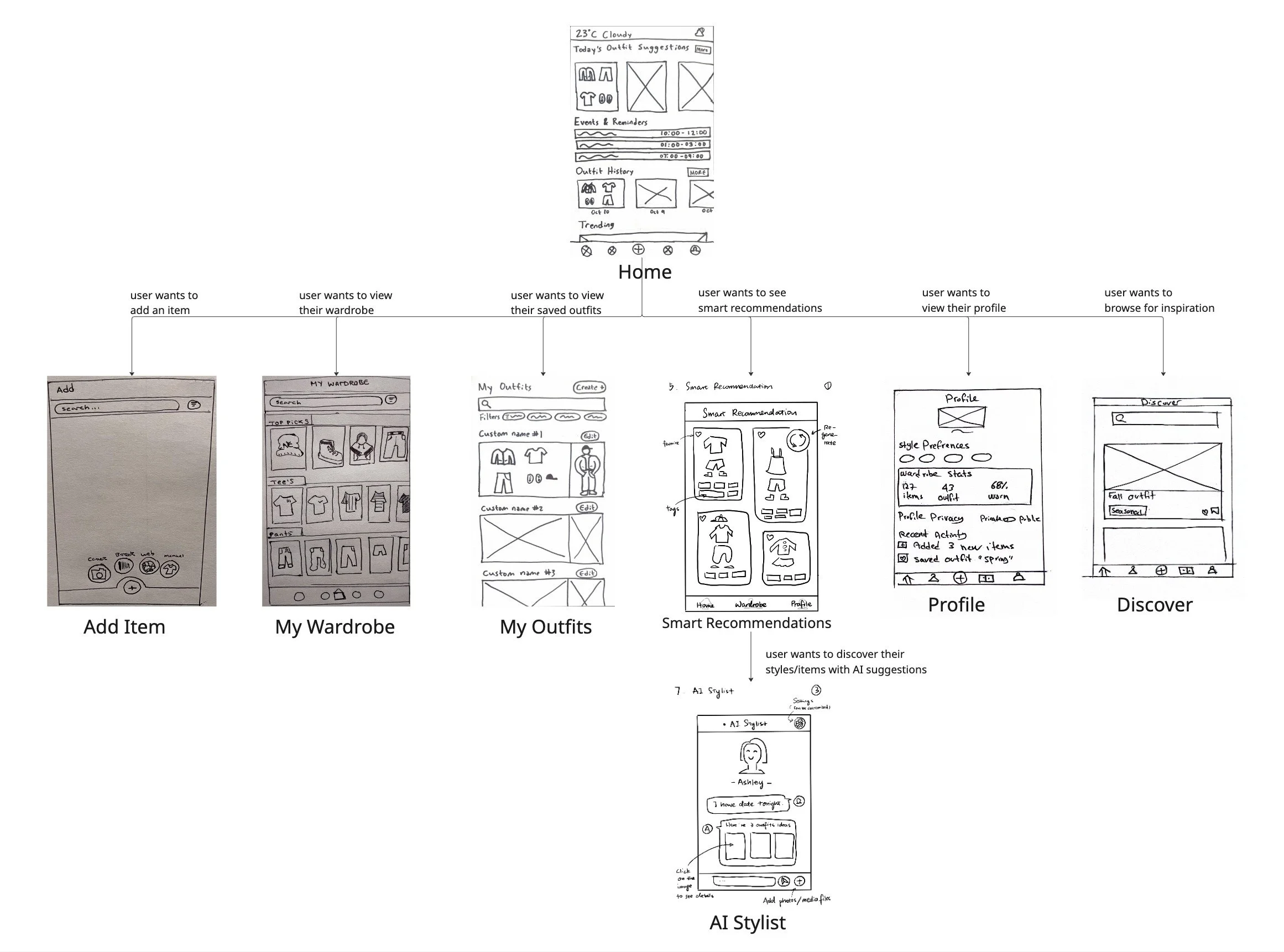
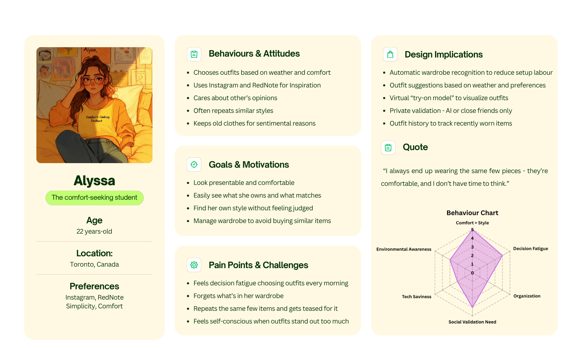
2. Ideation
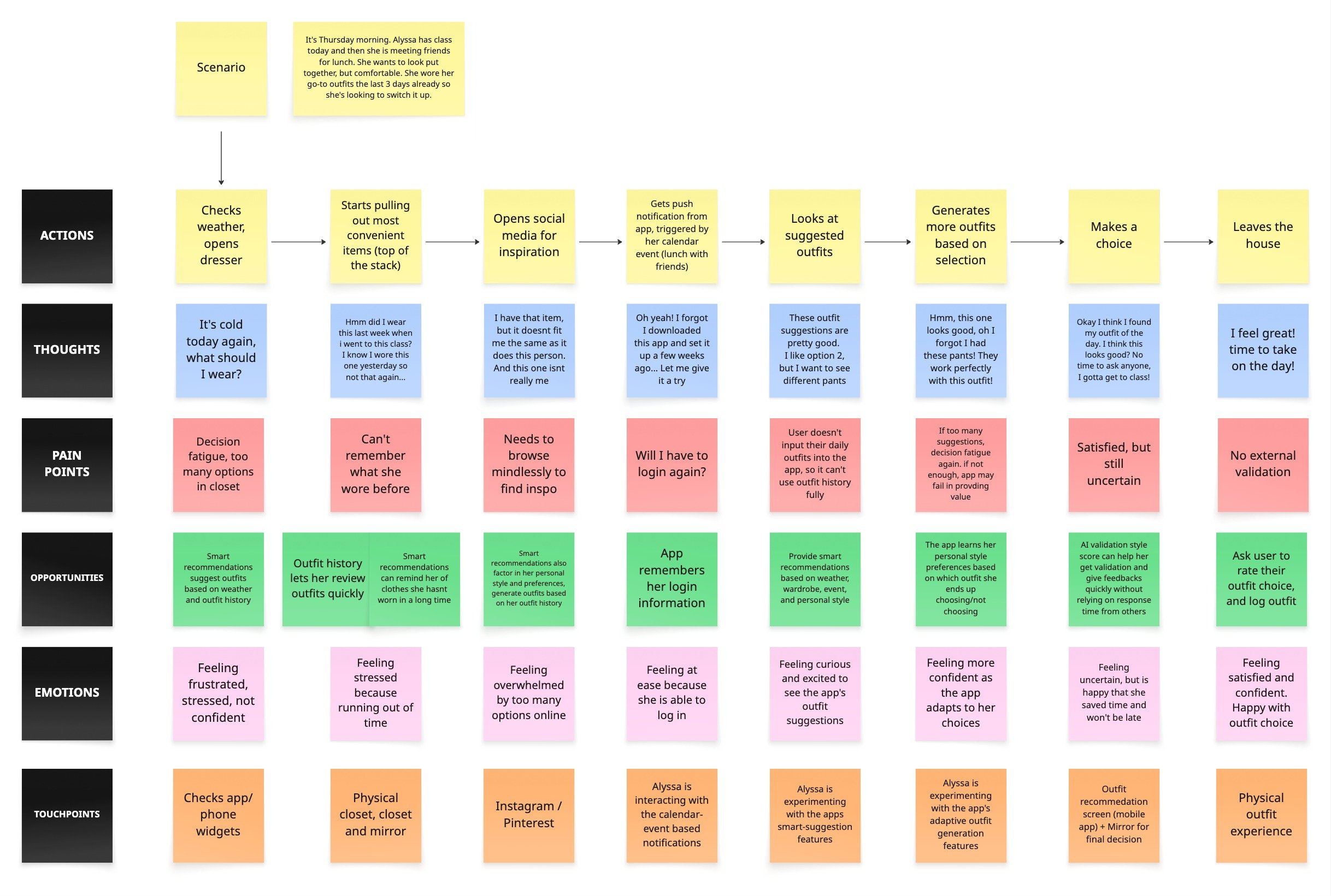
The ideation phase transformed our research into actionable structure. By defining the persona, mapping the journey, and building the task flow, we established the foundation for a solution centered on smart suggestions, low-friction onboarding, and private validation.
Methods Used
Persona creation
Journey mapping workshop
Storyboarding
Early sketching (Crazy 8s / low-fidelity concepts)
Task-flow diagramming
Problem framing refinement
Ideation at a Glance
1 primary persona created
1 journey map developed
1 full storyboard authored
2 task-flow diagrams defining core interactions
12+ low-fidelity concept sketches generated
3 core feature directions identified
Key Insights
Users need quick, low-effort guidance, not a long setup process.
Confidence dips at predictable points in their daily routine, especially before special events.
Weather, activity, and schedule must be core inputs into any recommendation engine.
People rely on a small set of “go-to” outfits → opportunity for rediscovery tools.
A clear interaction structure is necessary to avoid overwhelming the user.
My Contributions
Created the project’s primary persona (Alyssa) based on interview data and team synthesis.
Wrote the full journey-map scenario, outlining Alyssa’s emotional and behavioural flow.
Facilitated the journey mapping workshop, helping the team align on touchpoints and opportunities.
Authored the storyboard narrative used in the illustrated storyboard frames.
Built the complete task-flow diagram, defining the core screens and user interactions.
Assisted the team in refining problem framing to ensure ideation aligned with research insights.
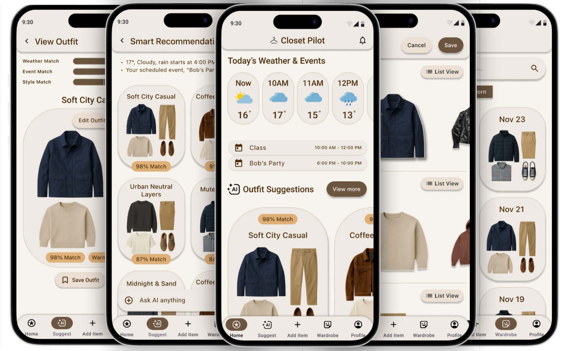
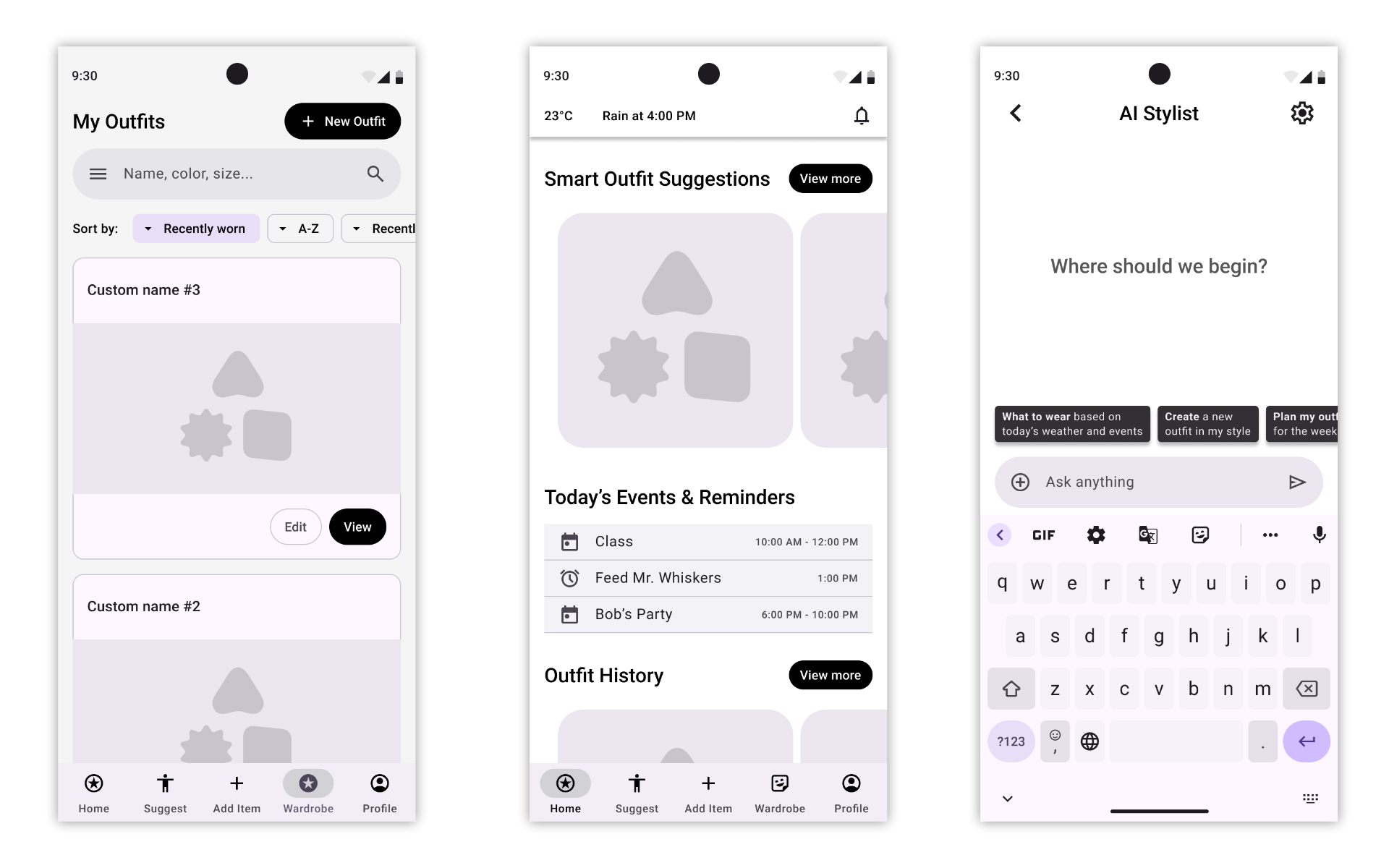
3. Prototyping
Prototyping transformed our concept into a tangible experience, evolving from rough sketches into a polished, interactive high-fidelity prototype. Each iteration focused on clarity, ease of use, and aligning the UI with the real behaviours uncovered during research.
Methods Used
Low-fidelity sketching (paper / whiteboard)
Mid-fidelity screen creation in Figma
Layout + hierarchy refinement
Interaction flow mapping
Clickable prototyping in Figma
Prototyping at a Glance
8 low-fidelity sketches
8 digitized mid-fidelity screens based on
those sketches1 unified interactive prototype built from all
screens
Key Insights
Having each person digitize their own screens created variety, but also inconsistencies that needed to be resolved.
A unified navigation pattern and layout system were essential for the prototype to feel coherent.
Connecting the screens into a single flow exposed gaps and edge cases that weren’t obvious in isolated sketches.
The prototype needed to support the core user journey clearly: viewing Smart Suggestions → customizing → saving → logging an outfit.
My Contributions
Coordinated the prototyping workflow by planning the sequence of tasks and distributing screen responsibilities across team members.
Participated in early sketching, contributing 2 core screens to the initial concept.
Refined and fixed the Figma screens to align layout, hierarchy, and interaction patterns.
Built the clickable prototype, connecting all team screens into a single, end-to-end flow.
Identified and patched missing states and transitions so the prototype could support our usability testing scenario.
4. Testing
Usability testing revealed where users hesitated or felt unsure, especially around customization and action labels. These findings guided targeted refinements that made the prototype more intuitive and aligned with real user expectations.
Methods Used
Scenario-based usability testing
Think-aloud protocol
Observation + note-taking
Task success + clarity evaluation
Insight synthesis using thematic grouping
Testing at a Glance
8 usability testing sessions
Scenario-based testing script tailored to class → rain → schedule
3 core tasks tested (Smart Suggestion → Customize → Save/Log OOTD)
18–33 minutes per interview
Key Insights
The Smart Suggestions feature was understood quickly, but the reason behind each suggestion needed clearer explanation.
Users wanted more guidance during outfit customization (e.g., clearer swap options, stronger visual cues).
Several users hesitated at the Save vs Log OOTD moment, indicating unclear labeling.
Navigation between Home, Smart Suggestions, and the Outfit View screens needed more consistency.
Participants appreciated the concept of private validation, confirming its importance as a feature.
My Contributions
Planned the entire usability testing approach, including scenario design and task flow.
Wrote the full testing script (instructions, moderator script, tasks, and follow-up questions).
Coordinated the testing timeline and ensured all team members completed their sessions on time.
Conducted multiple usability tests myself, taking detailed notes for each session.
Synthesized all team notes into a single set of findings, organizing insights into actionable recommendations.
Translated insights into specific prototype changes, including clearer CTAs, improved customization flow, and added rationale for Smart Suggestions.
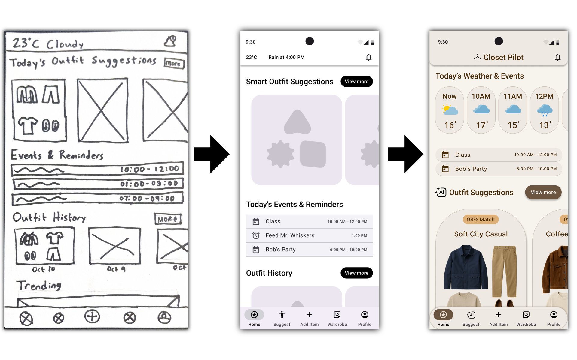
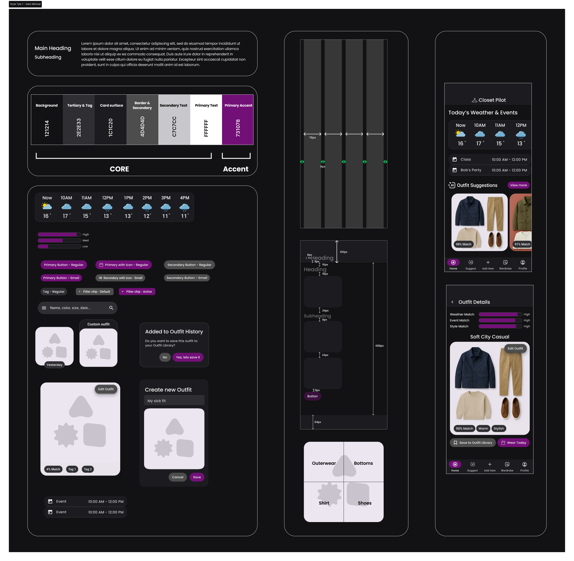
5. Iteration
Iteration focused on transforming a functional mid-fi prototype into a polished, cohesive high-fidelity experience. By applying user feedback, exploring multiple visual directions, and building a complete design system, the final prototype achieved clarity, consistency, and a strong visual identity grounded in research.
Methods Used
Usability-driven refinement
Creative direction development
Art direction exploration through style tiles
High-fidelity UI design
Visual system building (typography, color, spacing, cards, icons, buttons)
Final prototype reconstruction in Figma
Iteration at a Glance
3 major usability issues fixed based on testing
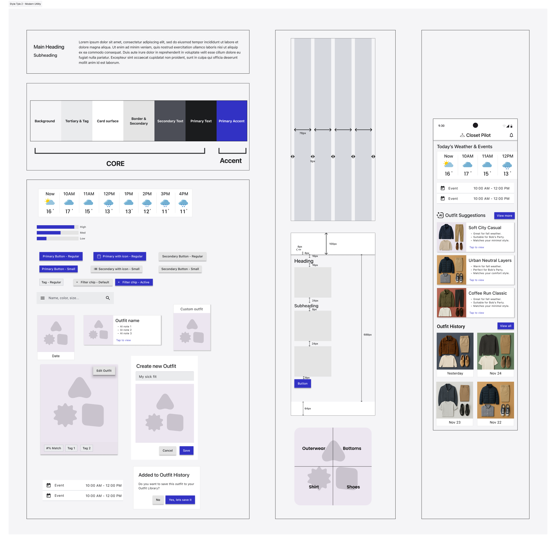
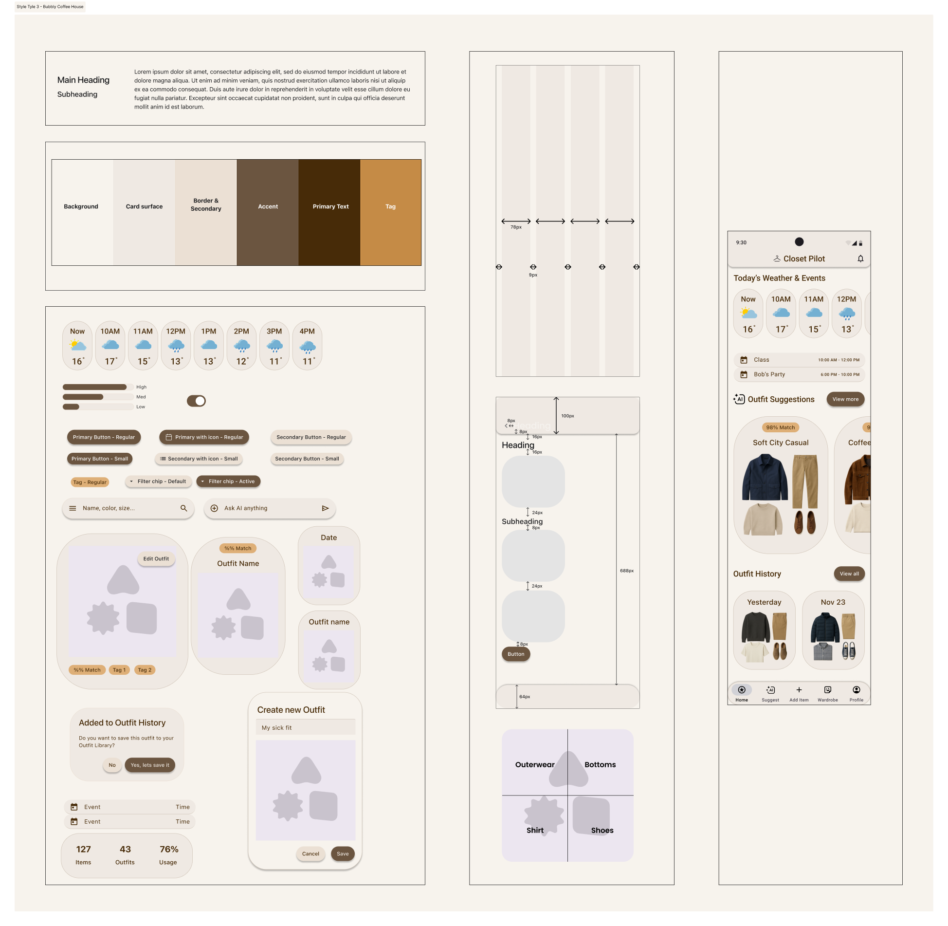
3 complete style tiles designed and evaluated
1 creative direction framework developed
1 final art direction selected and applied
35+ fully styled hi-fi screens redesigned
Entire prototype rebuilt with consistent visual + interaction patterns
Key Insights That Drove Changes
Users needed clearer guidance in key flows (Customize, Save, Log OOTD).
The original mid-fi screens lacked cohesive hierarchy and spacing, making customization feel cluttered.
Early prototypes didn't communicate a strong visual identity → required unified art direction.
Consistent components and real images improved trust, legibility, and usability.
Style exploration was essential to understand which mood and tone aligned best with user needs.
My Contributions
Interpreted our usability findings independently and selected three substantial issues to fix in my solo prototype.
Redesigned significant portions of the app, adding new screens, clearer flows, and more intuitive interactions while staying within scope.
Developed a complete Creative Direction framework: communication goals, mood, tone, and guiding adjectives.
Created three distinct Style Tiles, each exploring different visual systems, typographic hierarchies, color palettes, layouts, icons, buttons, and photographic styles.
Tested each Style Tile on a few screens to validate feasibility and emotional resonance.
Selected the strongest Style Tile and applied it to the entire prototype, refining it as needed during implementation.
Replaced all placeholder content with realistic text and real images, elevating the fidelity across the full prototype.
Built the final high-fidelity prototype with a polished, consistent visual system, redesigned components, improved spacing, and smoother interactions.
Updated the Final Style Tile to reflect the true design direction used throughout the prototype.
Skills Built
UX Research & Synthesis
Strengthened my ability to design interview scripts, extract themes from qualitative data, and translate insights into clear design direction.
Interaction & Visual Design
Built stronger proficiency in wireframing, component design, and creating a cohesive high-fidelity prototype. Learned to explore and evaluate multiple visual directions through style tiles.
Usability Testing & Iteration
Improved at identifying actionable issues from testing and applying targeted refinements to improve clarity, flow, and overall usability.
Project Coordination & Team Leadership
Gained experience structuring work phases, assigning responsibilities, and ensuring consistency across team contributions.
Looking Forward
This project reinforced the value of a structured process, rapid iteration, and clear communication. I’ll carry these habits into future UX work to design with more intention, clarity, and user alignment.